Message from Champion
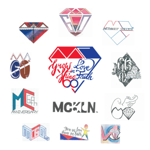
The shape of the logo is a diamond, which indicates the Diamond Jubilee of our school. The top of the logo makes use of negative space, to spell out 'MC', which are the initials of our school, Methodist College. The heart and cross shapes blend together within the calligraphy of our 60th anniversary slogan, 'Grow in Love • Shine in Faith', symbolizing 'Love' and 'Faith' respectively. The use of the infinity symbol ∞ in Mathematics to represent '60 years’ denotes our school’s commitment to the perpetual and never-ending cultivation of elite students. Finally yet importantly, the bottom of the logo makes use of negative space to make a shape of heart, which shows the care and love among everyone in our school.
By 5B Sherene Li (Designer of the winning logo)